
Public Health
Service Design
Enterprise UX
Modernizing Public Health Data Reconciliation
Designed a modern reconciliation platform for the CDC that transformed spreadsheet-driven workflows into a clearer, more scalable experience for state and federal public health teams.
The Problem
Public health data is only useful if people can trust it.
Every day, state public health agencies send disease surveillance data to the CDC. In theory, those records should match. In reality, they often don’t.
An investigation might begin with something as simple as a case count being off by one. From there, epidemiologists would manually compare spreadsheets, search through multiple systems, and rely on years of institutional knowledge to determine whether the problem was a reporting error, a missing record, or simply two systems interpreting the same data differently.
The work wasn’t difficult because people lacked expertise. It was difficult because the tools never gave them a clear place to start. Our goal wasn’t simply to build another application. It was to make finding the truth easier.
Why It Was Hard
This wasn’t a software problem. It was an ecosystem problem.
One of the biggest lessons I learned on ACCURATE is that complex systems rarely have a single source of truth. Every participating state had slightly different workflows, data quality, reporting schedules, and operational constraints. What looked like “bad data” was often the result of different business rules or legitimate differences in how systems stored information. That meant we couldn’t design for one workflow. We had to design for many.
The challenge wasn’t deciding where to place a button or simplify a screen. It was creating a process that gave users confidence regardless of which state they represented. That required spending far more time understanding how people worked than deciding what the interface should look like.
My Role
I led UX from discovery through MVP.
From the beginning, my responsibility wasn’t just designing screens.
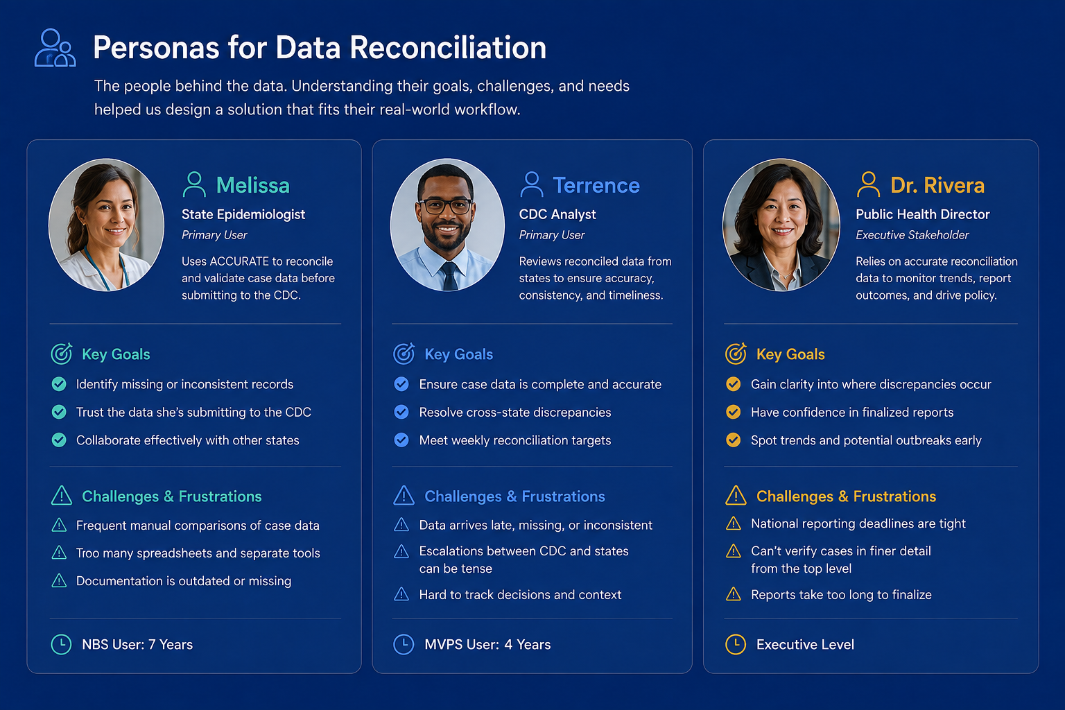
I partnered with CDC stakeholders, epidemiologists, engineers, product managers, and participating states to understand the reconciliation process, identify pain points, and translate complex operational workflows into a product that felt structured and approachable.
My work included:
• Planning and facilitating discovery sessions
• Interviewing users and subject matter experts
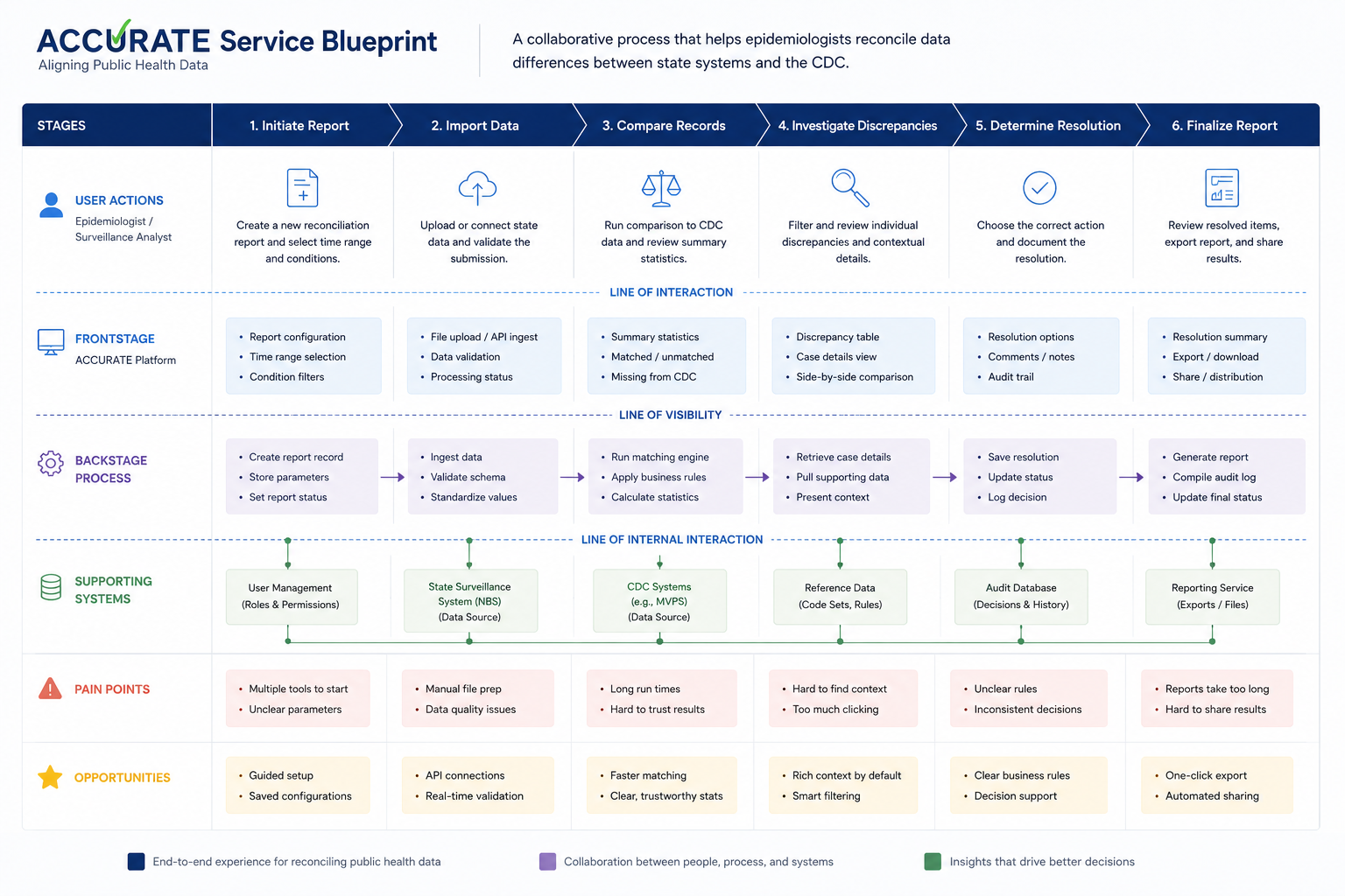
• Mapping reconciliation workflows and service blueprints
• Creating wireframes and interactive prototypes
• Validating designs with CDC and state partners
• Working closely with engineering throughout implementation
One thing I’ve learned over the years is that good UX isn’t created in Figma. It’s created through conversations. By the time I started designing interfaces, most of the difficult design decisions had already been made through discovery. The work wasn’t difficult because people lacked expertise. It was difficult because the tools never gave them a clear place to start. Our goal wasn’t simply to build another application. It was to make finding the truth easier.
How We Got There
We resisted the urge to build first
Instead of immediately designing a complete solution, we focused on understanding the entire reconciliation journey. We observed how epidemiologists compared records, documented decision points, identified where uncertainty entered the process, and mapped how information moved between state systems and the CDC.
One insight quickly became clear. Users didn’t need more information. They needed better context. That realization shaped everything that followed.
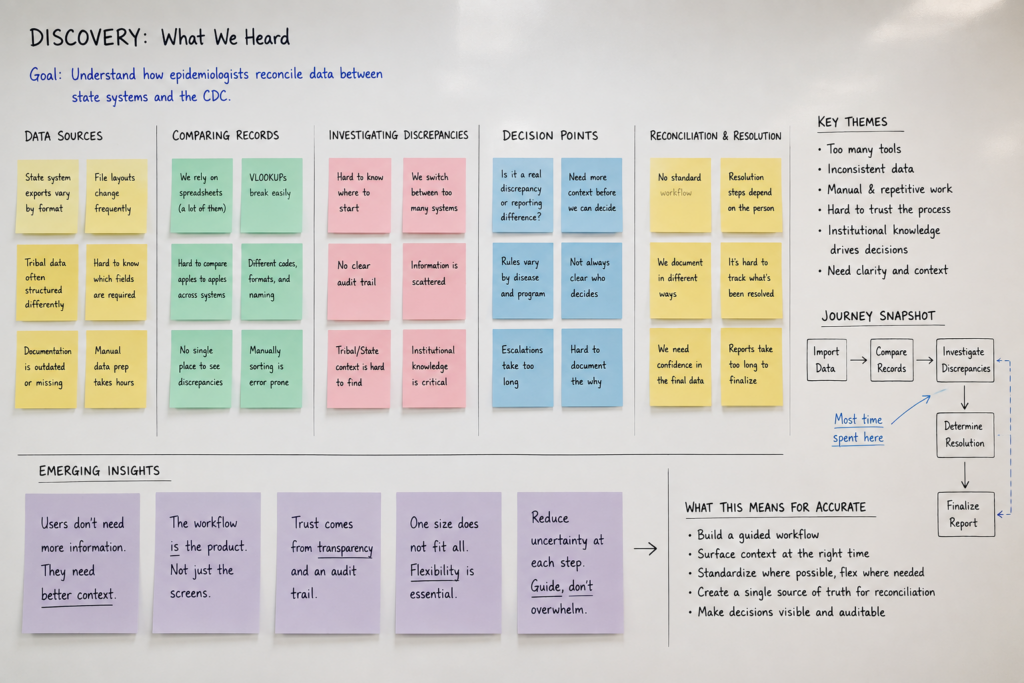
Rather than designing isolated screens, we designed an end-to-end workflow that guided users from importing data through reviewing discrepancies and ultimately resolving them with confidence. Discovery didn’t validate our assumptions. It replaced them.
Key Design Decisions
Every major decision reduced uncertainty.
One idea continued to surface during interviews…
People weren’t asking for more features. They wanted to know where to begin.
That changed how we approached the product.
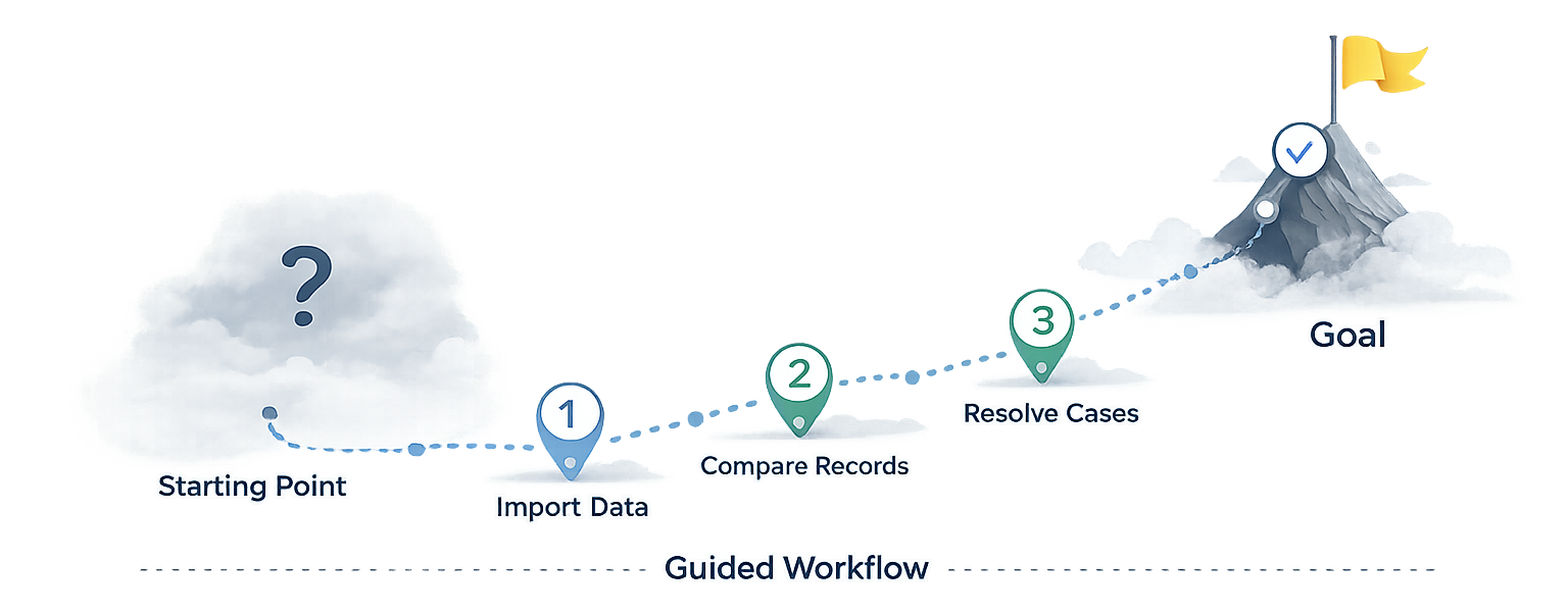
Instead of presenting large tables of data immediately, we broke reconciliation into a guided workflow.
• Users first understood the health of the report
• Then reviewed discrepancies
• Then investigated individual cases
• Then resolved them
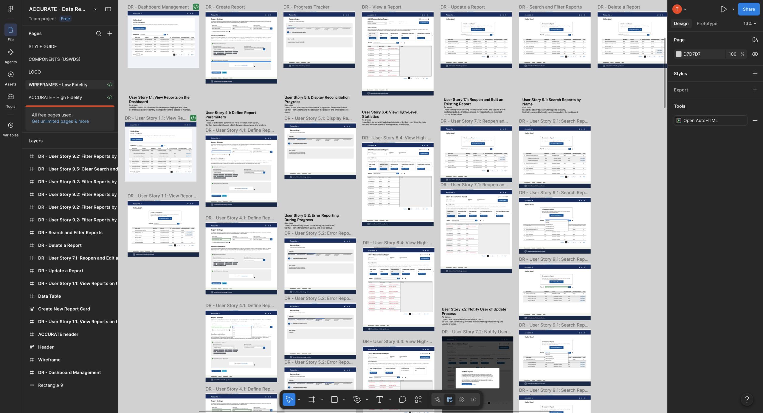
Wireframes Lo-Fi
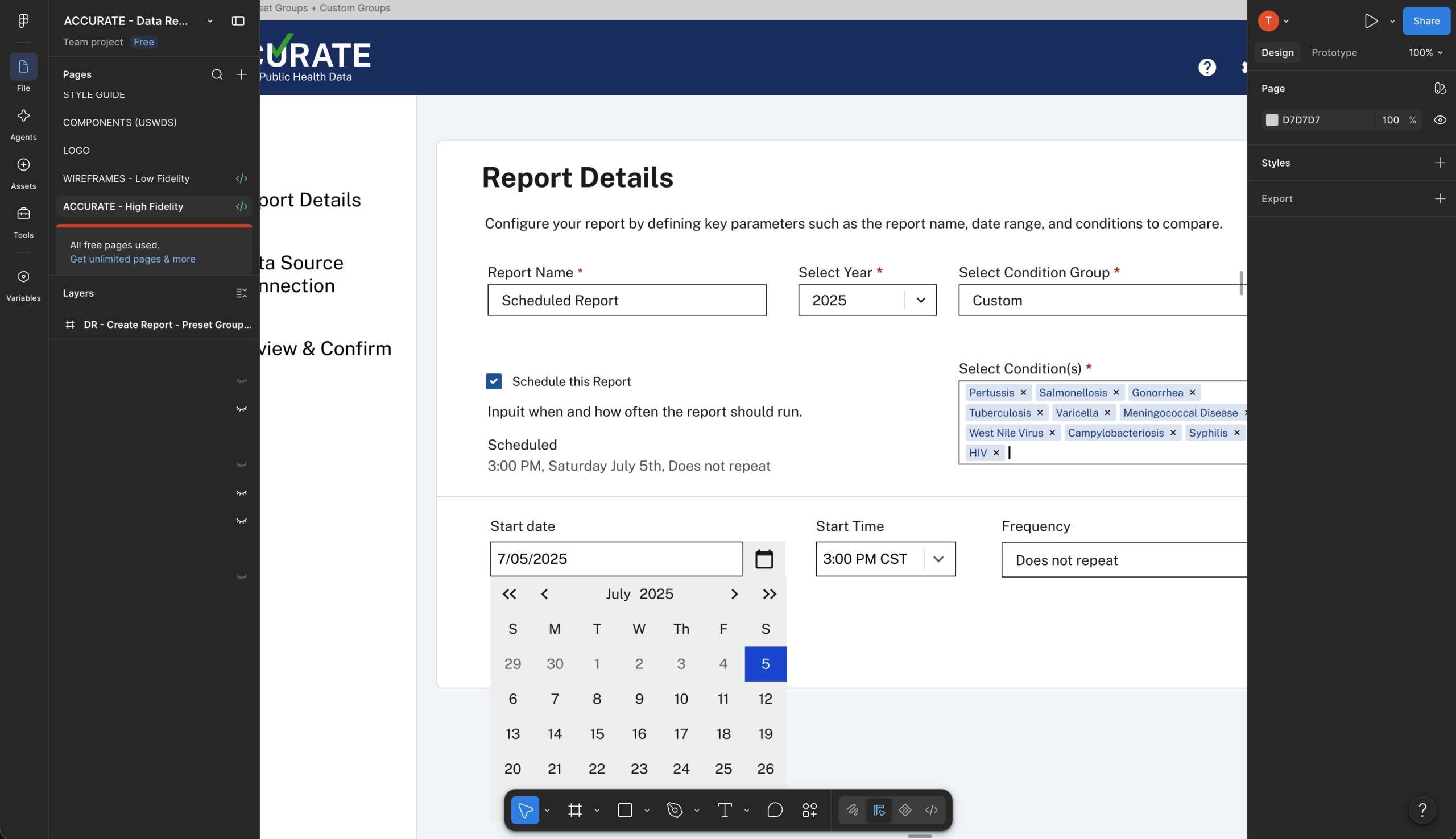
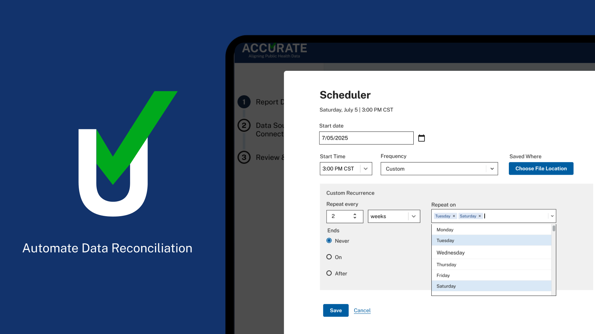
Schedule Reports Hi-Fi
Every screen answered one question before introducing the next. Looking back, that was probably the most important design decision we made. Not because it simplified the interface. Because it simplified the thinking required to use it.
The Product
Transforming reconciliation into a guided experience.
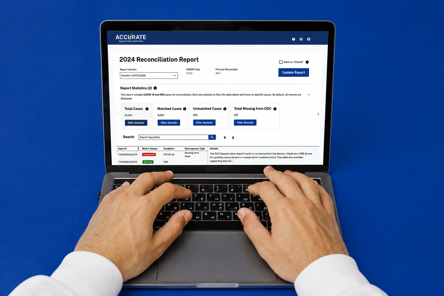
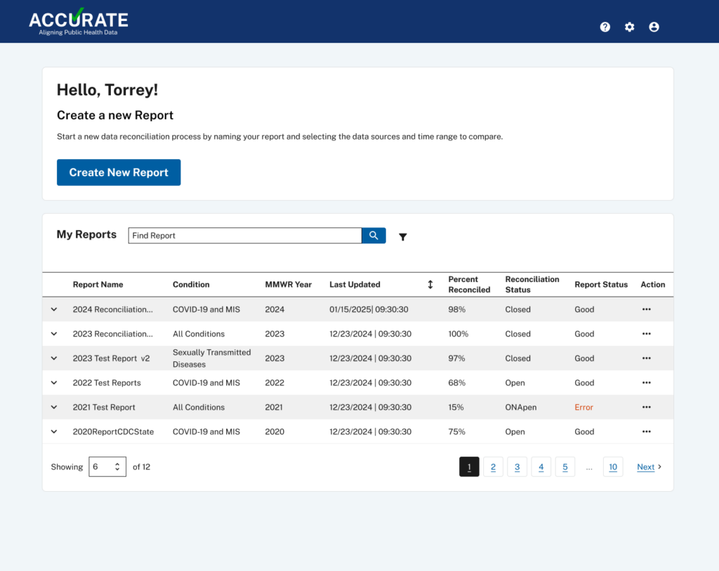
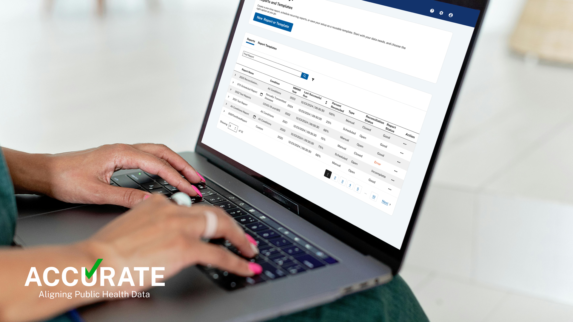
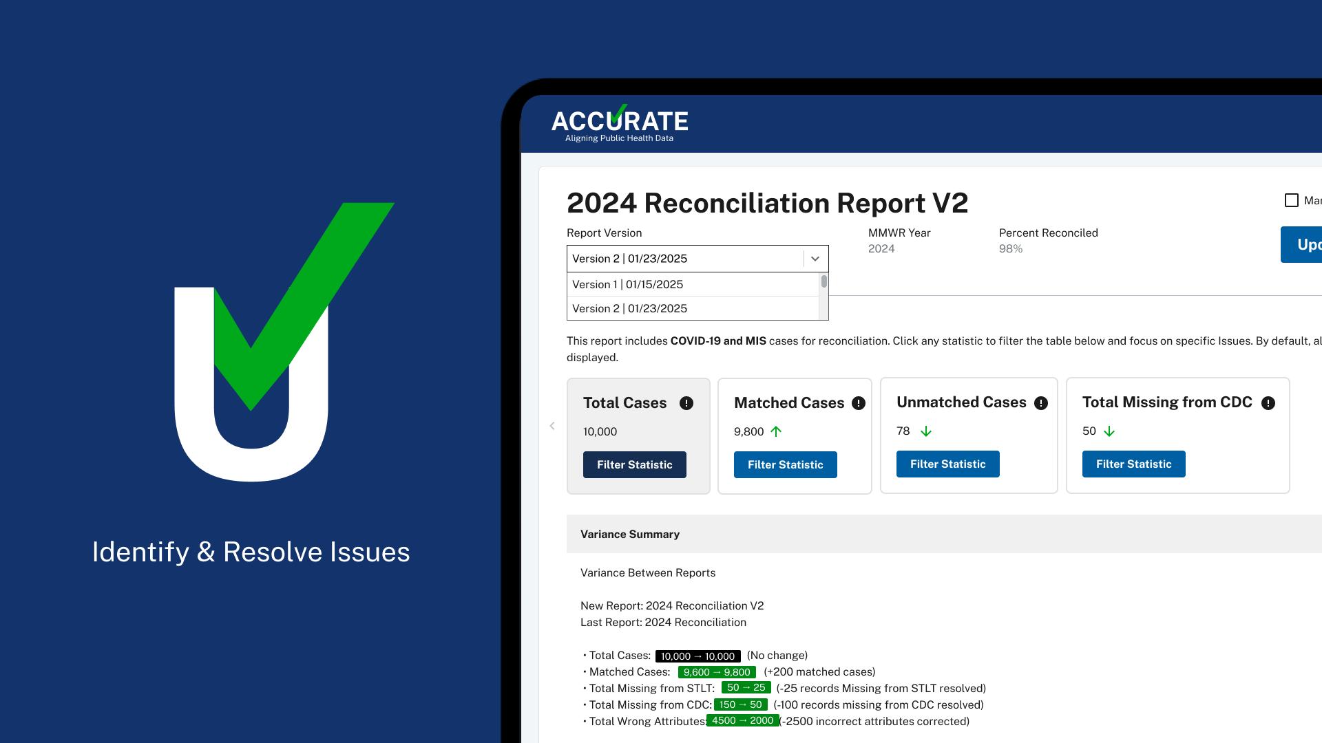
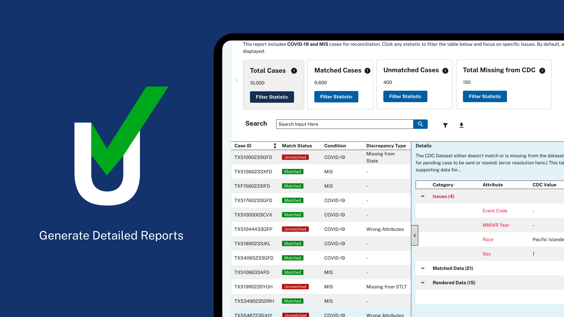
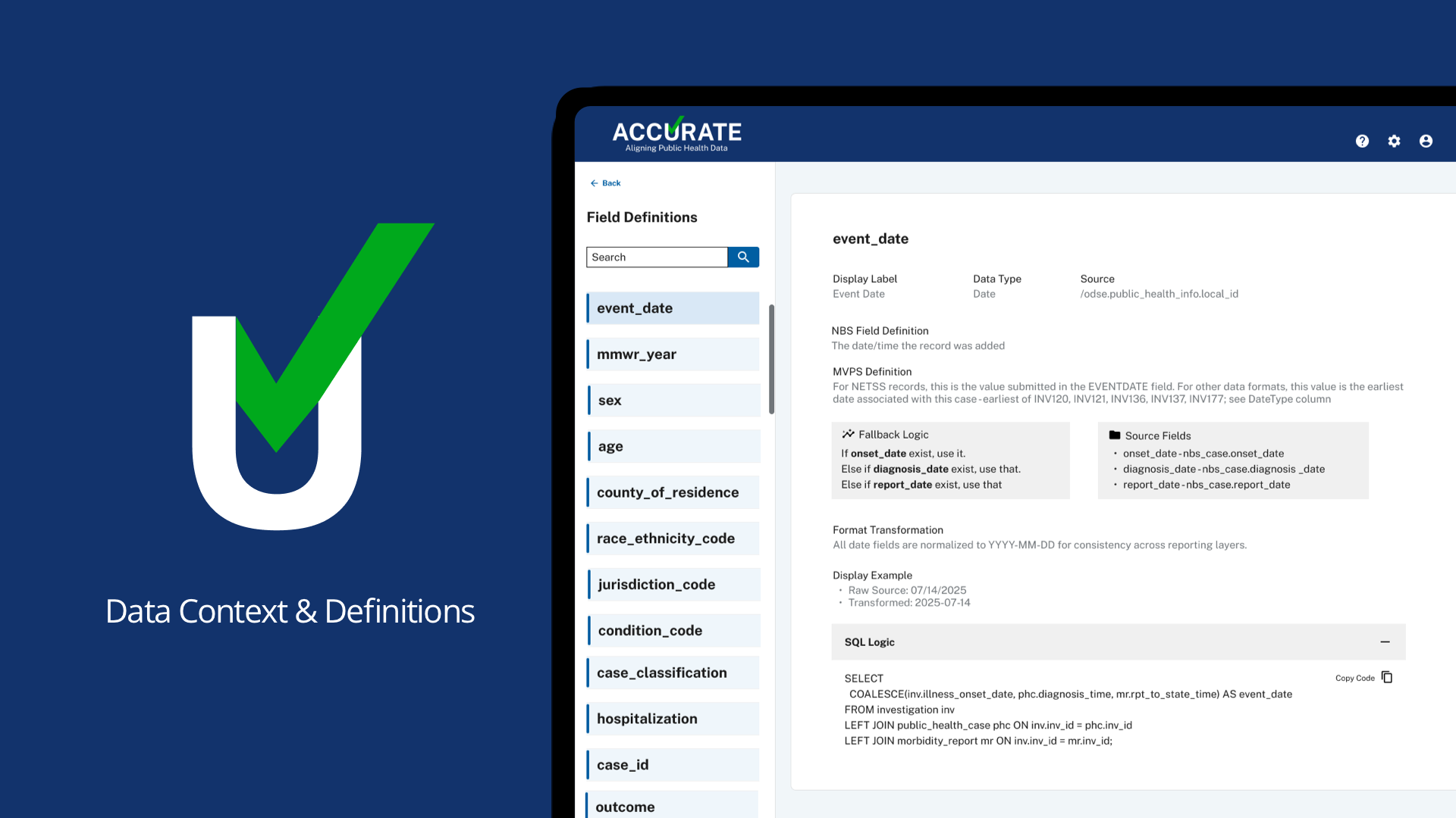
The final product replaced disconnected spreadsheets with a structured workflow that helped epidemiologists focus on investigating discrepancies instead of finding them. Rather than overwhelming users with thousands of records at once, the experience guided them step by step—from creating a reconciliation report, to identifying discrepancies, to comparing case details, and ultimately documenting a resolution. Each stage provided the right information at the right time, reducing cognitive load and giving users confidence in the decisions they were making.
The platform allowed users to:
• Generate reconciliation reports
• Identify missing or mismatched records
• Filter discrepancies by category
• Compare CDC and state values side by side
• Review supporting details
• Resolve issues through a consistent workflow
Rather than trying to automate human judgment, the product supported it. The goal wasn’t replacing expertise. It was allowing experts to spend their time solving problems instead of searching for them.
The work wasn’t difficult because people lacked expertise. It was difficult because the tools never gave them a clear place to start. Our goal wasn’t simply to build another application. It was to make finding the truth easier.
Results
Better workflows create better decisions.
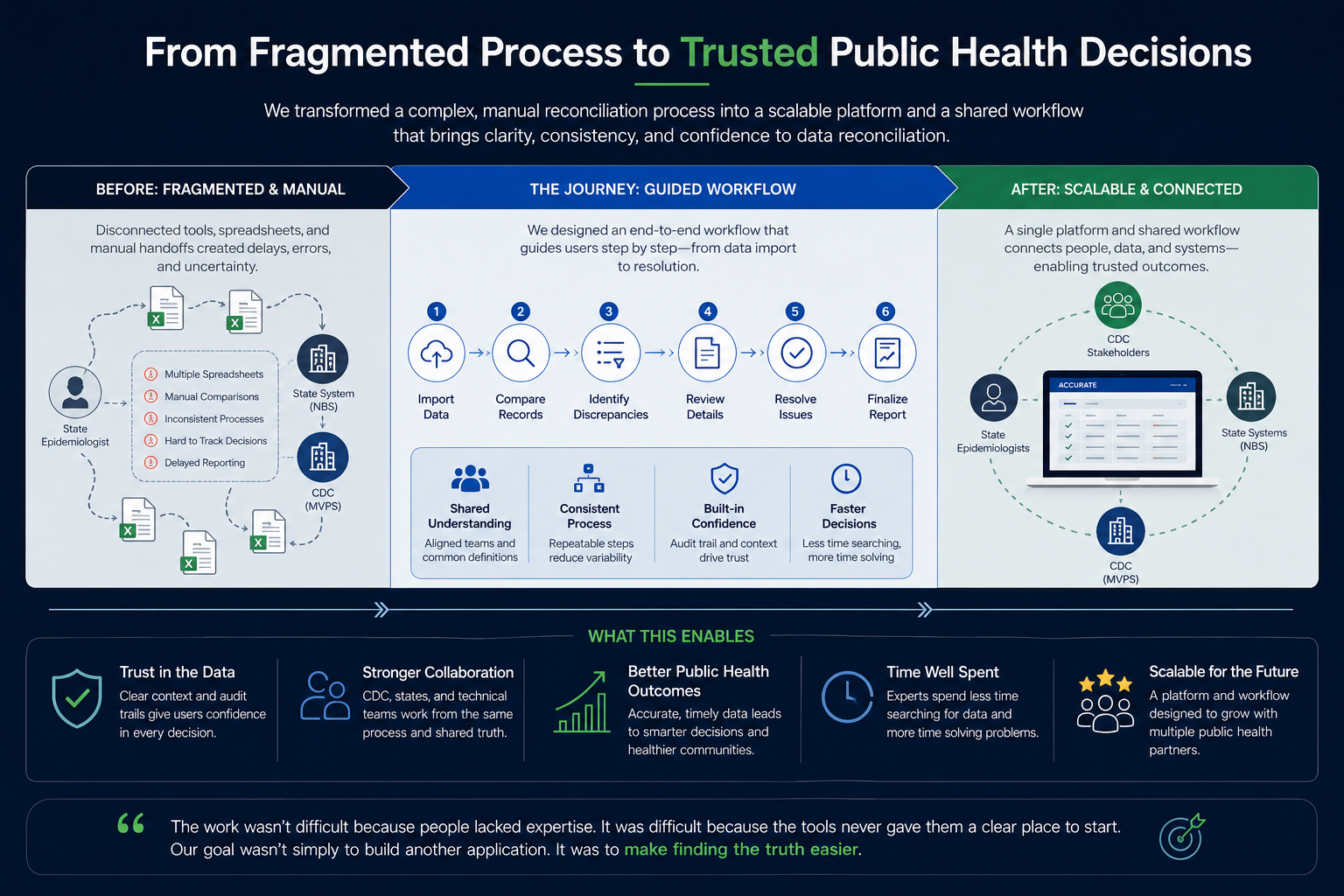
By the end of the project, we had transformed a fragmented manual process into a scalable reconciliation platform that could support multiple public health partners. Just as importantly, we established a shared workflow between technical teams, CDC stakeholders, and participating states. Success wasn’t measured by how many screens we designed. It was measured by how much easier it became for people to trust the data they were working with.
That trust is what ultimately enables better public health decisions.
Reflection
Great UX reduces uncertainty.
Every project teaches you something.
ACCURATE reinforced something I’ve experienced throughout my career. People rarely struggle because software is complicated. They struggle because they’re uncertain about what to do next. Whether I’m designing for healthcare, defense, cybersecurity, or enterprise platforms, I find myself asking the same question:
“What is creating uncertainty for the user?”
Once you answer that, the interface often becomes obvious. ACCURATE reminded me that good UX isn’t about making software beautiful.
It’s about helping people move forward with confidence.
Have a complex problem to solve?
I’m always interested in thoughtful conversations about product design, service design, enterprise systems, and human-centered AI.