Enterprise SaaS
Design System
Surveillance
Building a Scalable Design Foundation
Created a unified design system that brought consistency, scalability, and efficiency to FLIR Raven and future enterprise products.
Overview
What was this engagement?
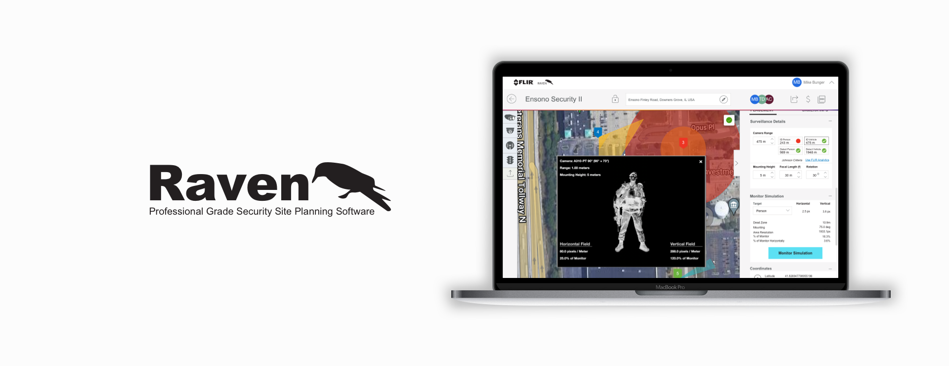
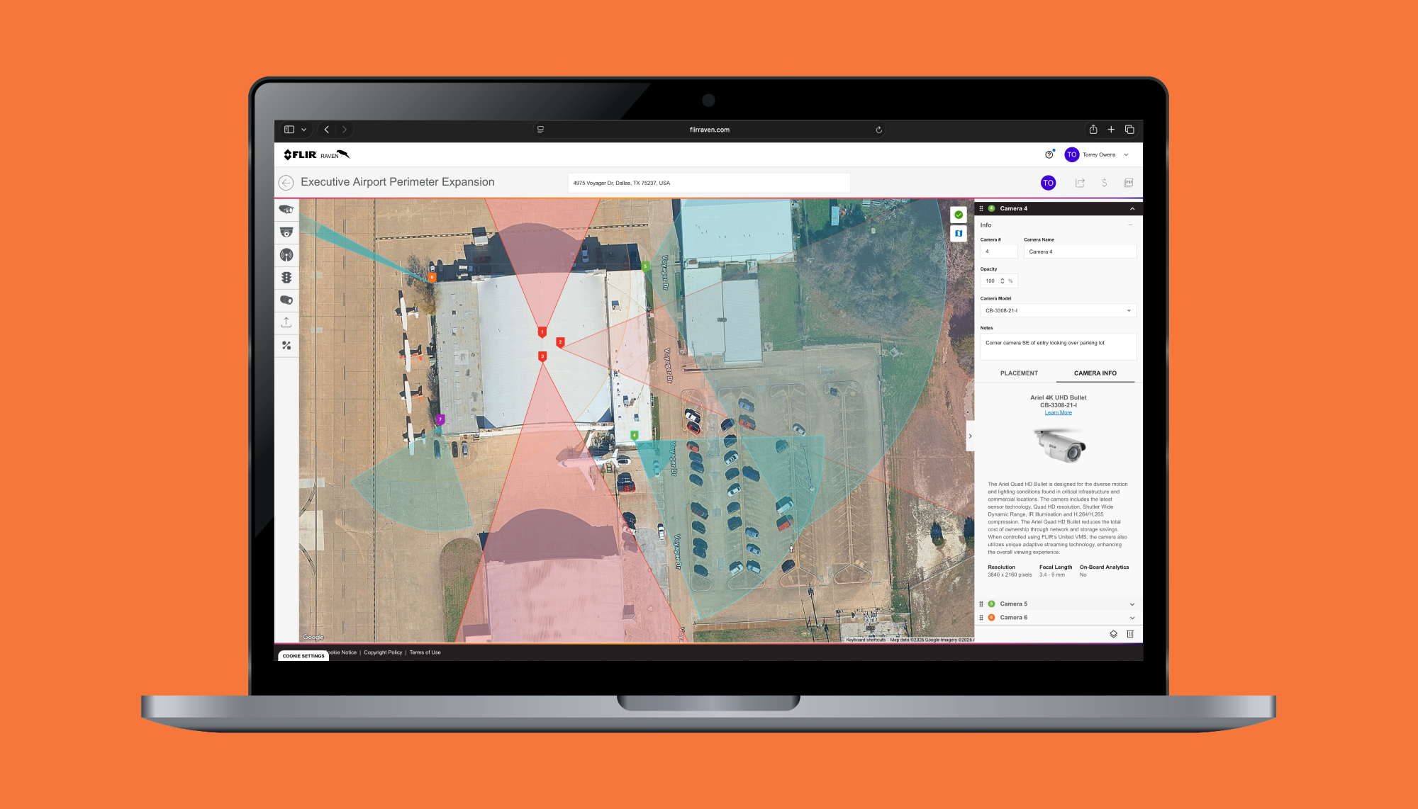
FLIR Raven is a web-based site planning platform used by enterprise organizations to design and manage complex security deployments.
As the product evolved over many years, the interface became increasingly inconsistent. Different teams solved similar problems in different ways, creating duplicate patterns, inconsistent interactions, and unnecessary complexity.
Rather than simply redesigning screens, our objective became establishing a shared design language that could scale across Raven and future Teledyne products.
I led UX Design.
Role
Lead UX Designer
Duration
12 mos
Responsibilities
UX Research • Information Architecture • UI Design • Design System •
Component Library • Interaction Design • Developer Collaboration
Collaborators
Product Management • Engineers • Google • UX
Deliverables
Enterprise Design System • Figma Component Library • Interactive Prototypes • Storybook React Components • Design Specifications • Developer Handoff
The Challenge
How do you redesign a product without redesigning it over and over again?
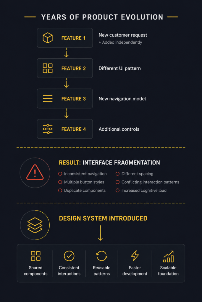
The Raven platform had been evolving for years. New features had been added by different teams, at different times, to solve different customer needs. Over time, those individual decisions created a larger problem.
• Buttons behaved differently
• Forms followed different layouts
• Tables used different spacing
• Navigation patterns changed between workflows
None of these issues were catastrophic on their own, but together they increased cognitive load for users and slowed product development. The redesign wasn’t simply about creating a more modern interface. It was about creating consistency.
One insight quickly became clear. Users didn’t need more information. They needed better context. That realization shaped everything that followed.

Discovery
How did we understand the inconsistencies?
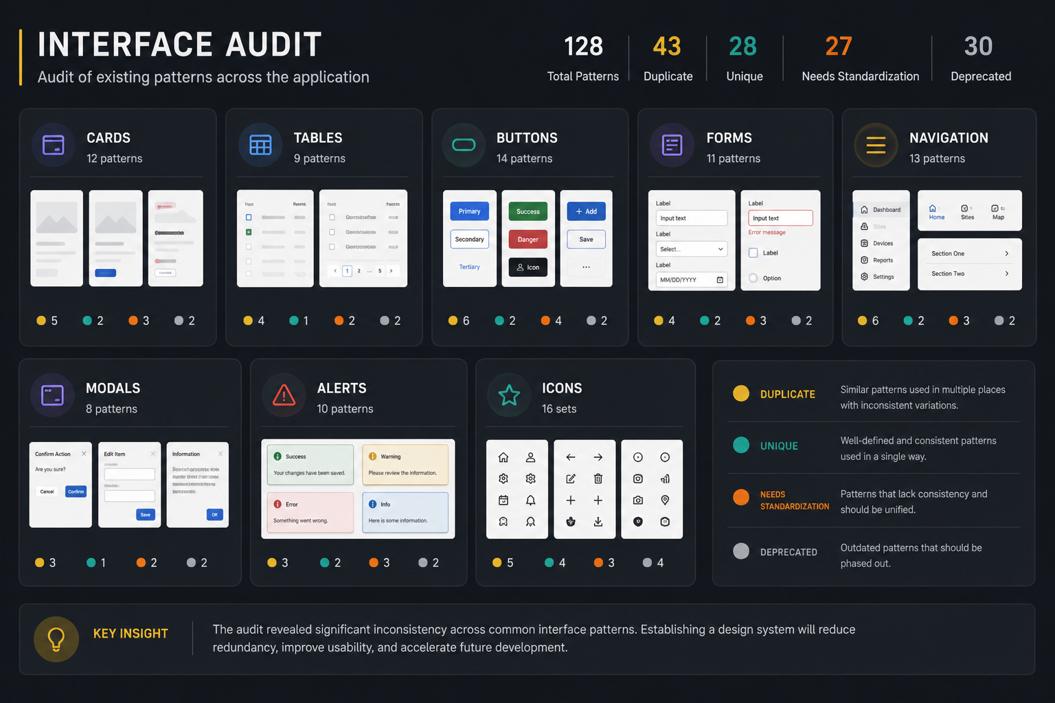
Before designing new screens, we audited the existing product. We cataloged recurring interface patterns, navigation models, layouts, typography, form controls, and reusable components.
Instead of asking, “How should this screen look?” We asked,
“What patterns already exist?”
“What works?”
“What creates friction?”
This inventory became the foundation for every design decision that followed.
Framing
Organizing the patterns.
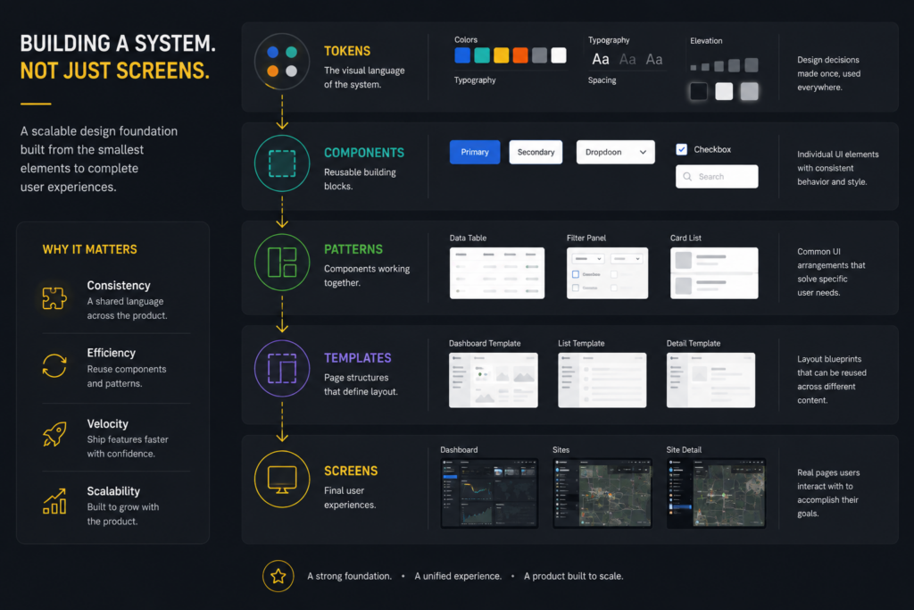
Rather than redesigning each screen independently, we identified the core building blocks that appeared throughout the application.
Those patterns became reusable design primitives.
By separating components from individual pages, we created a system that allowed future features to inherit consistent behaviors instead of introducing new variations.
One insight quickly became clear. Users didn’t need more information. They needed better context. That realization shaped everything that followed.
Design System
Building a shared language.
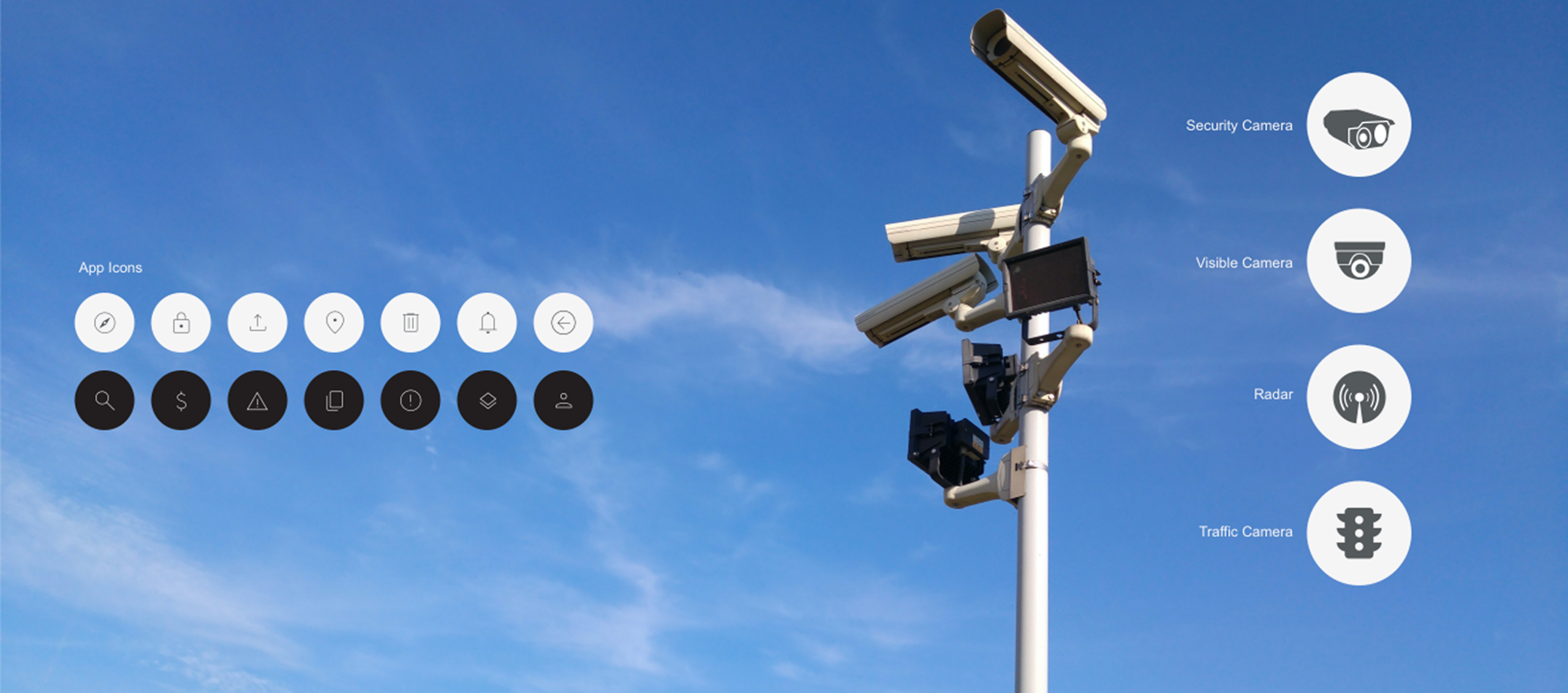
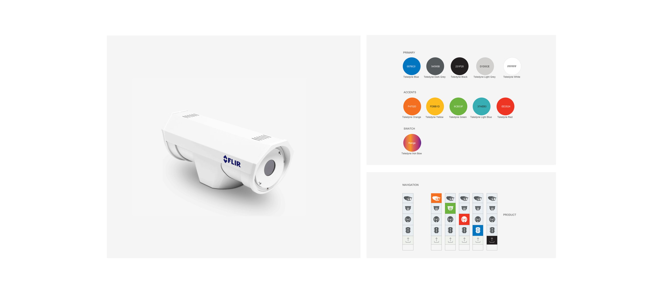
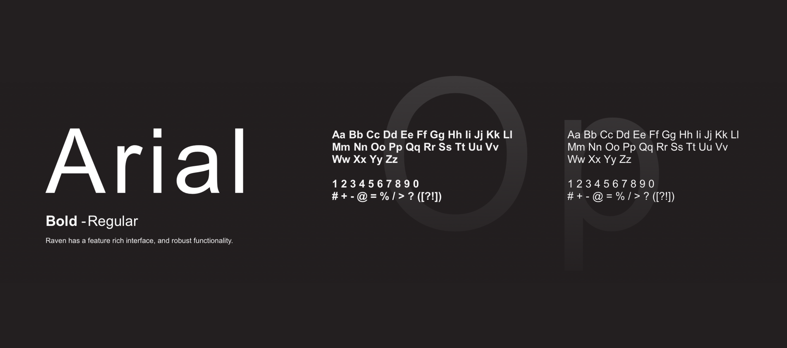
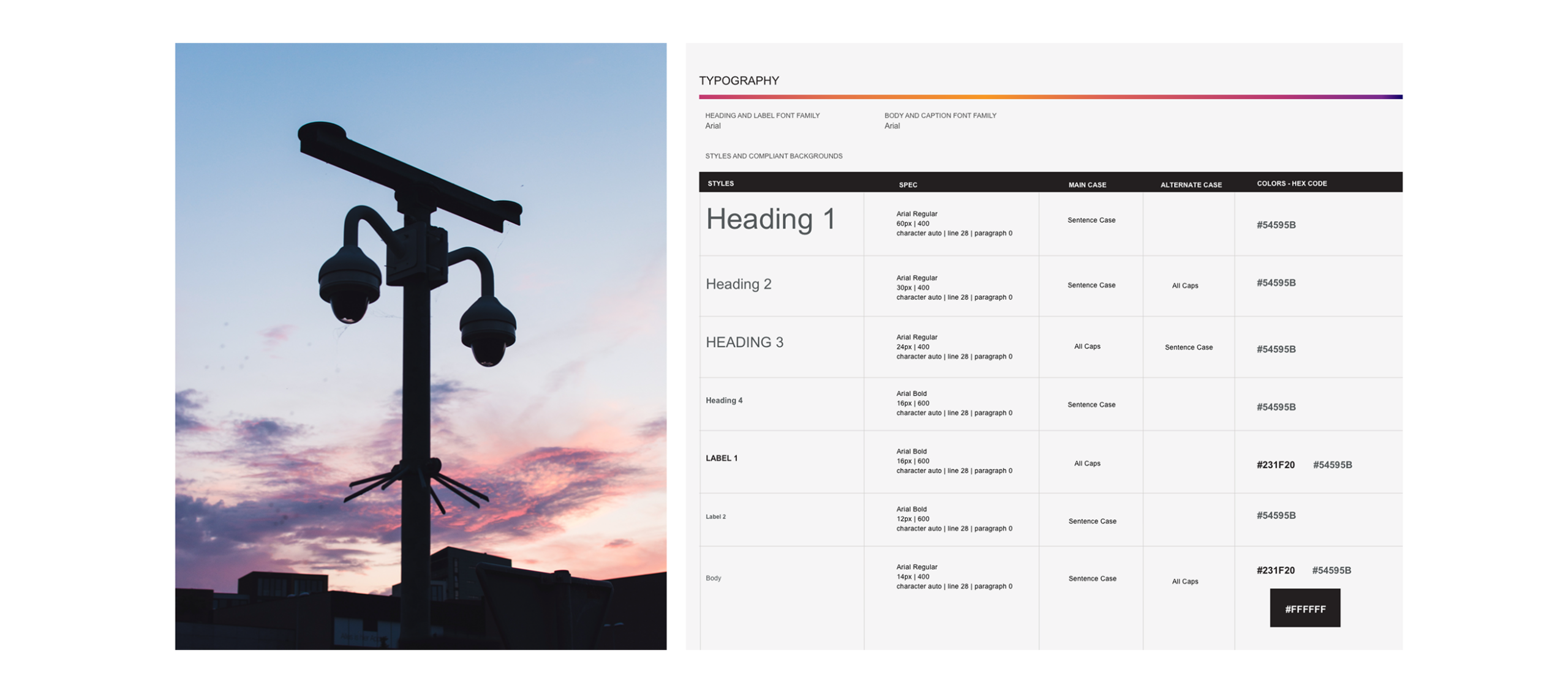
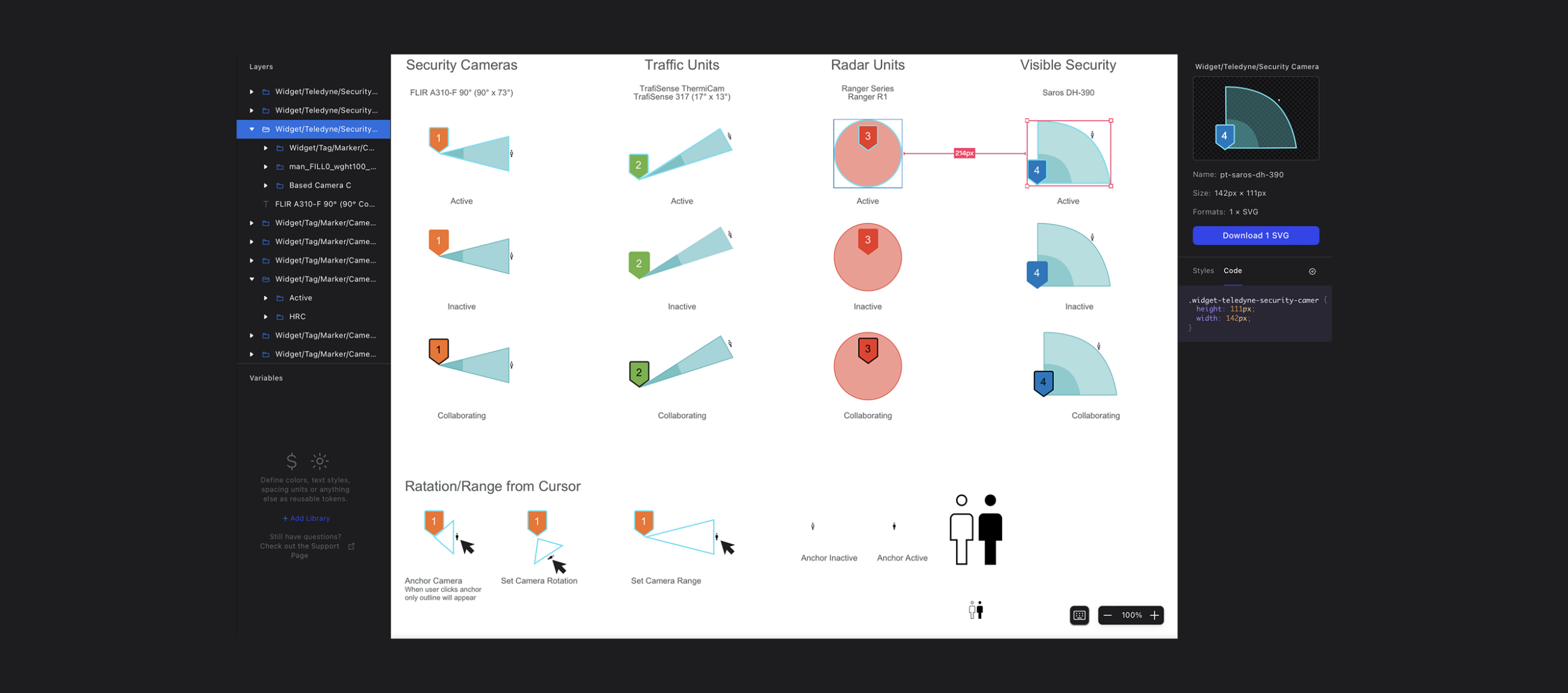
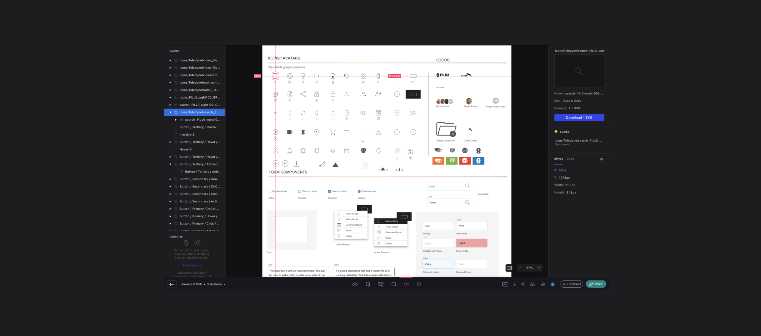
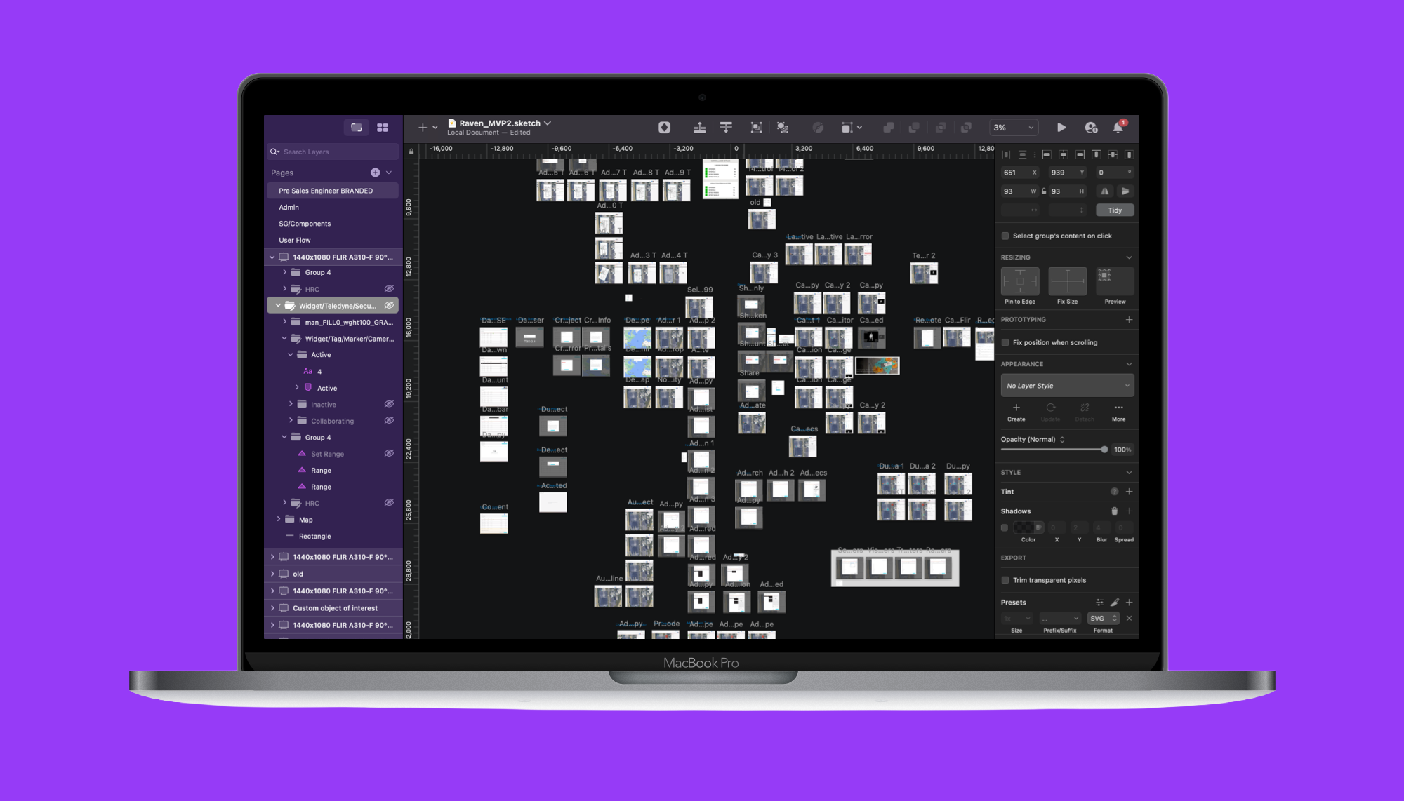
The design system became much more than a UI kit. It established common rules for spacing, typography, colors, icons, interaction states, accessibility, and reusable components.
Designers could move faster.
Developers could build with greater consistency.
Product teams could introduce new functionality without reinventing existing patterns.
Rather than treating every project as a blank canvas, the system provided a shared foundation.
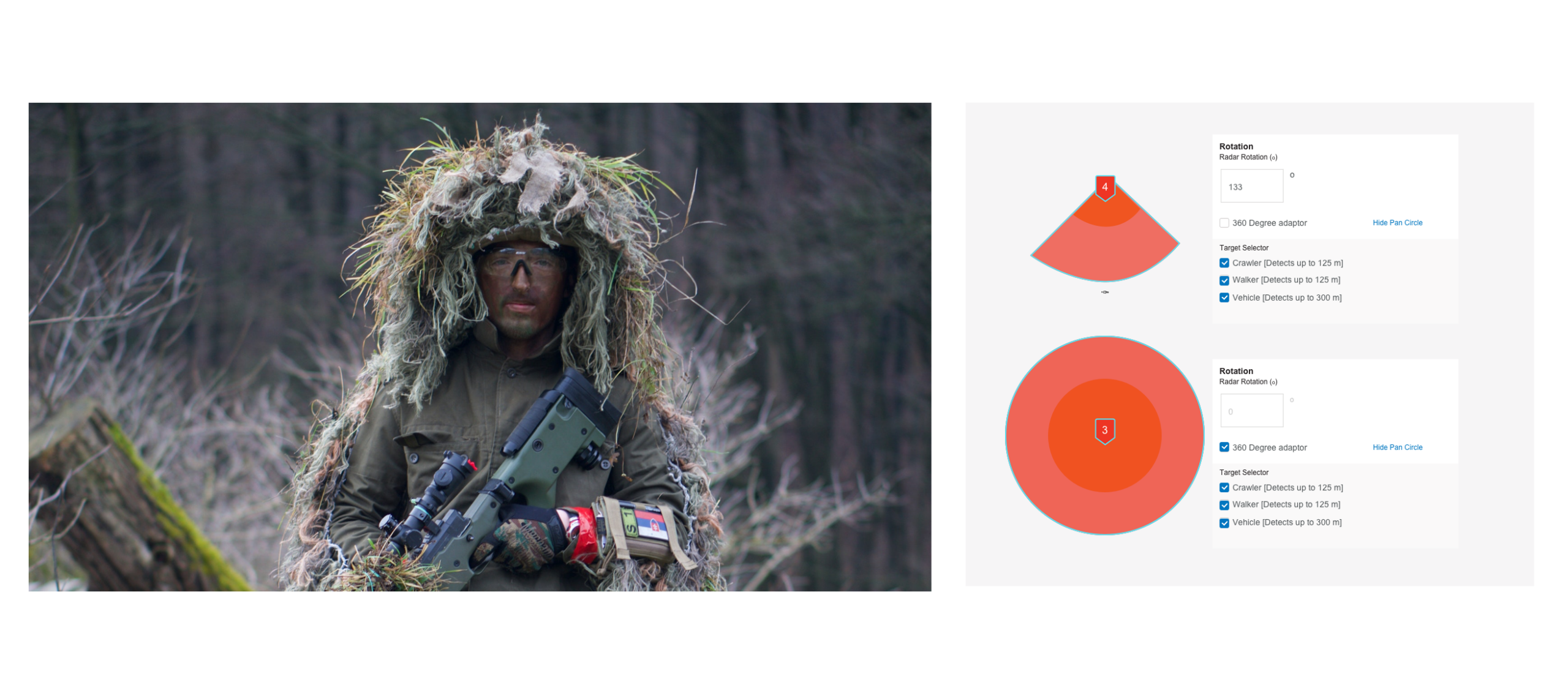
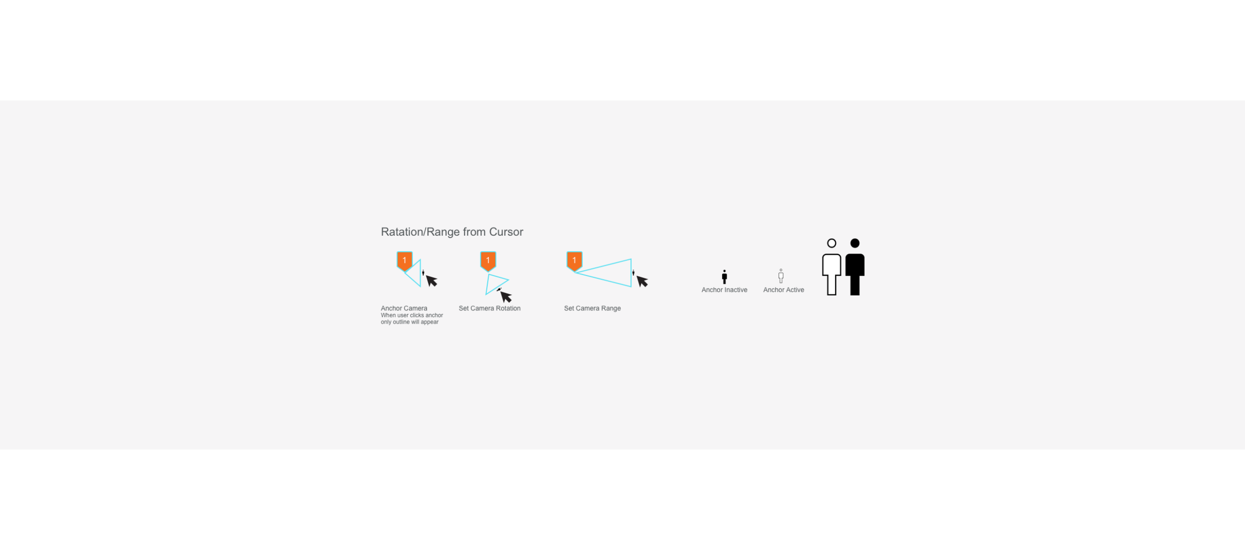
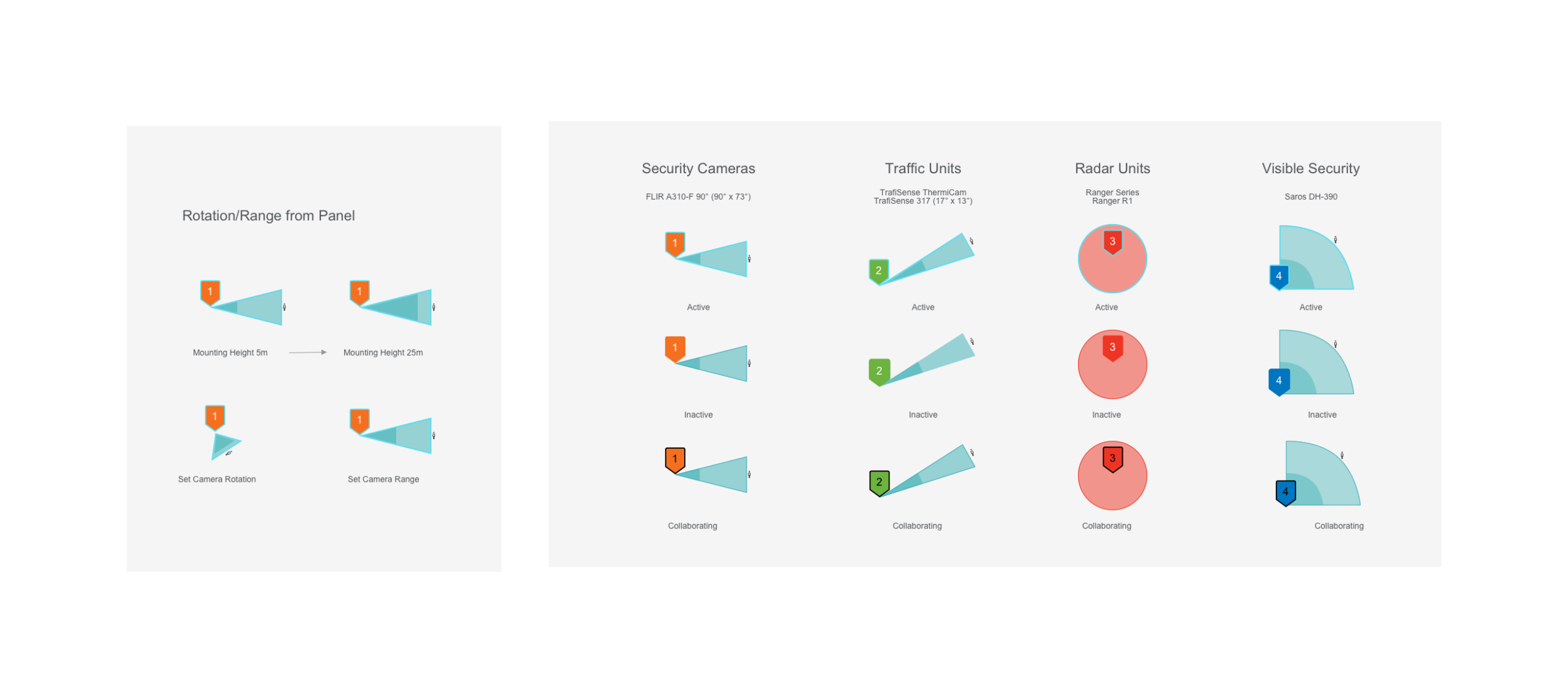
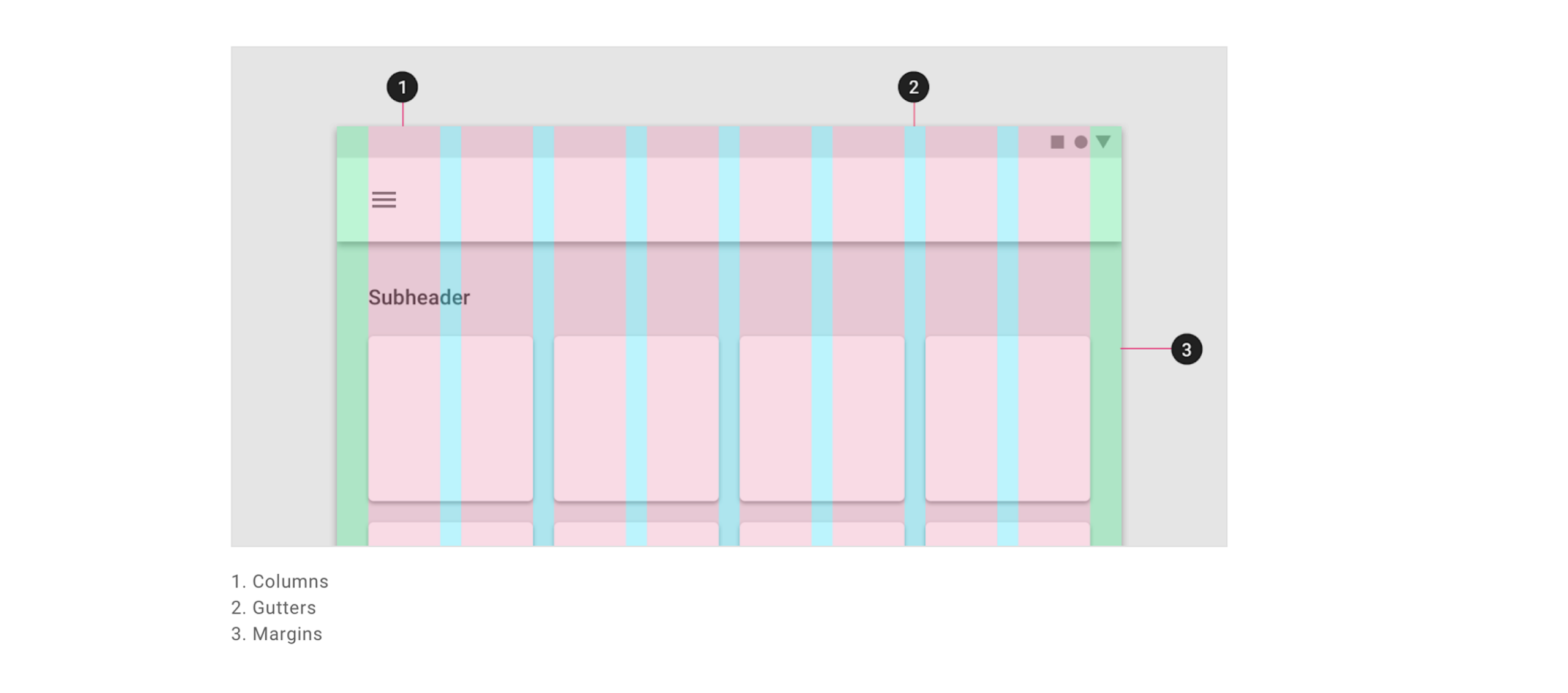
Application
Bringing the System to Life.
The design system moved beyond documentation once it was applied throughout Raven.
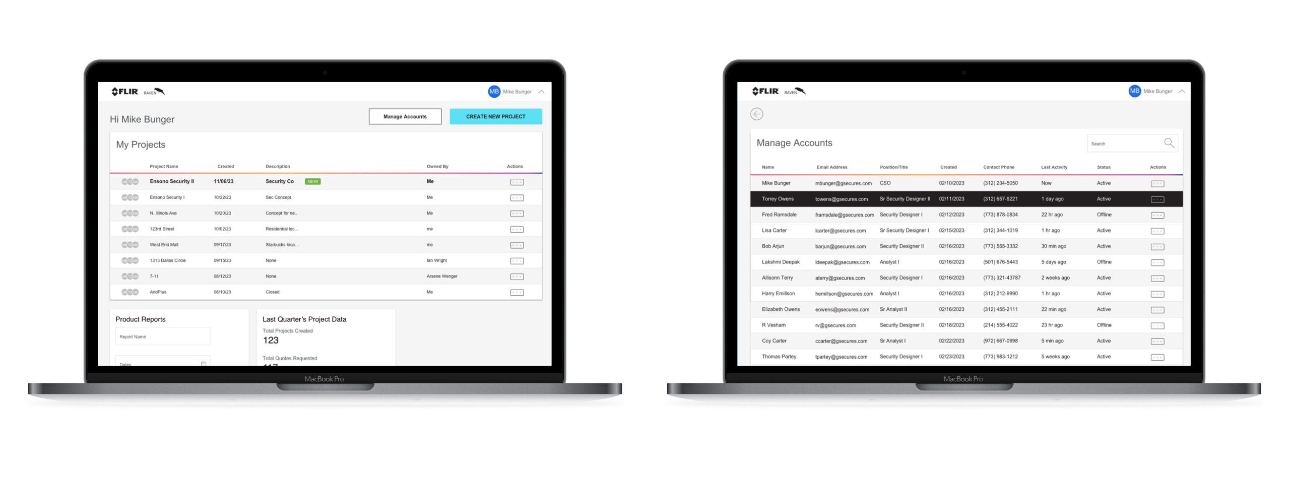
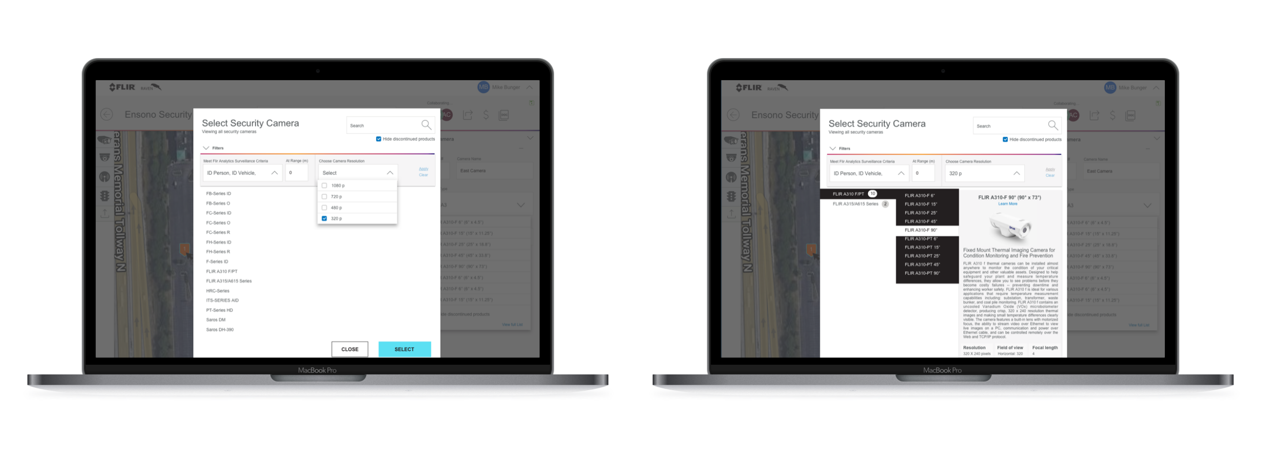
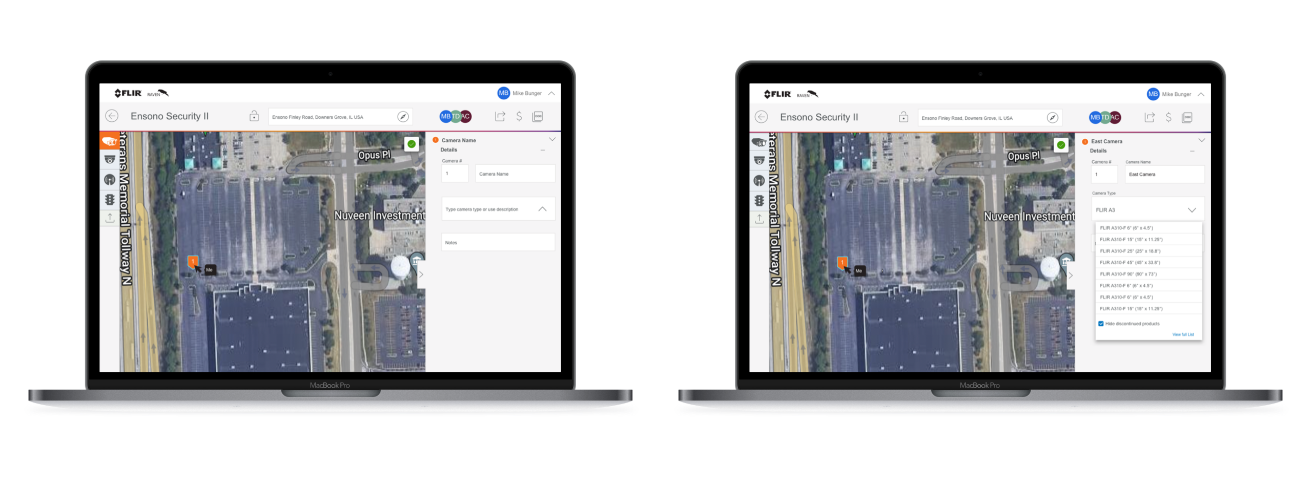
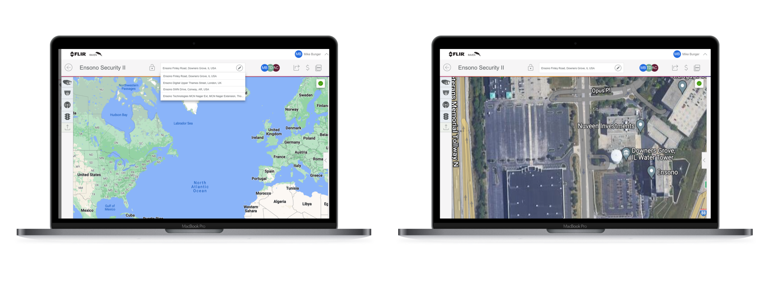
Core workflows—including navigation, search, forms, tables, and settings—were rebuilt using shared components and consistent interaction patterns. As new features were introduced, they naturally inherited the same visual language and behaviors instead of creating new variations.
The result was a product that felt cohesive, predictable, and easier to navigate, while giving designers and developers a common foundation for future enhancements.
Impact
What changed?
The redesign improved more than visual consistency. Teams gained a common vocabulary for discussing interface decisions and developers spent less time recreating components. Design reviews shifted from debating individual pixels to solving user problems. Most importantly, Raven established a scalable foundation that could support future growth across Teledyne products. Success wasn’t measured by how many components we created. It was measured by how much easier it became to build the next feature.
shared design system brought consistency to navigation, workflows,
and interactions across the Raven platform
Reflection
What did I learn?
One of the biggest lessons from Raven was realizing that design systems aren’t about creating components. They’re about reducing decision fatigue. Every standardized pattern removes dozens of future conversations about how something should look or behave. That consistency allows teams to spend less time reinventing interfaces and more time solving meaningful customer problems. The most valuable design systems aren’t the ones with the most components.
They’re the ones people stop noticing because everything simply feels predictable.
Have a complex problem to solve?
I’m always interested in thoughtful conversations about product design, service design, enterprise systems, and human-centered AI.